
Redefined the user experience for two core websites while pushing the branding bounds.
Client
Discovery Place
Year of Project
2022-2023
Role
Senior UI / UX Designer
―
Discovery Place is a leading hub for science education and exploration in the Carolinas. Their four different museums have interactive exhibitions as well as a larger-than-life IMAX Dome Theatre. The team at Discovery Place partnered with Purple, Rock, Scissors to modernize their corporate and Discovery Place Science museum websites while targeting key company-wide goals: increase ticket sales to exceed pre-pandemic levels and enhance the ease of use for their team members when working in the CMS.


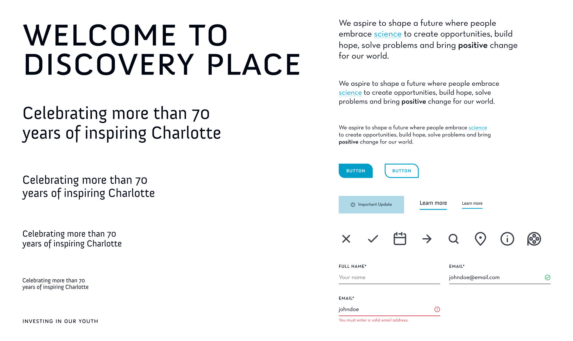
Design Vision
At the onset, I wanted to create an engaging, welcoming, and sophisticated design that would allow Discovery Place and its separate locations to have their own unique voices, while sharing the same overarching brand message: we are not just a place to have a great time, but a place to learn. With an ease of use, the flow through the site would not only establish a better ticket-purchasing flow, but would help bring more people through the door without questions.
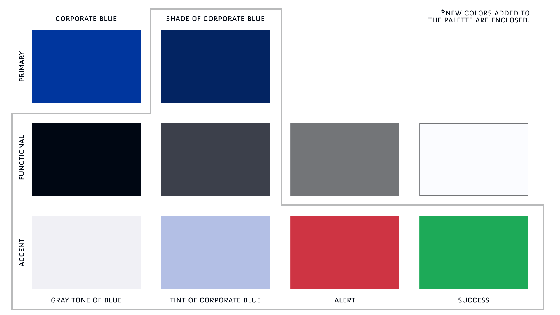
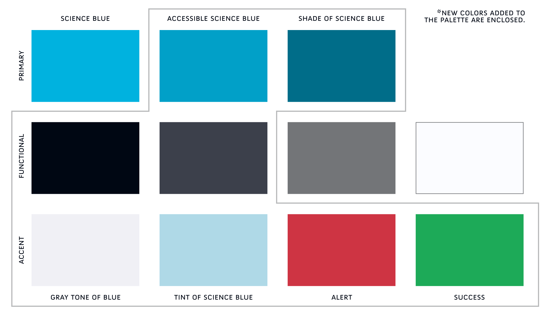
Color Palette
For both the Discovery Place Corporate website and the Discovery Place Science website, I provided a palette that was derived from the individual brand’s color palettes. I extrapolated the main color and built hues of each around those to add depth and really delineate each of the individual brands, rather than have too many colors at play within each brand.
Type
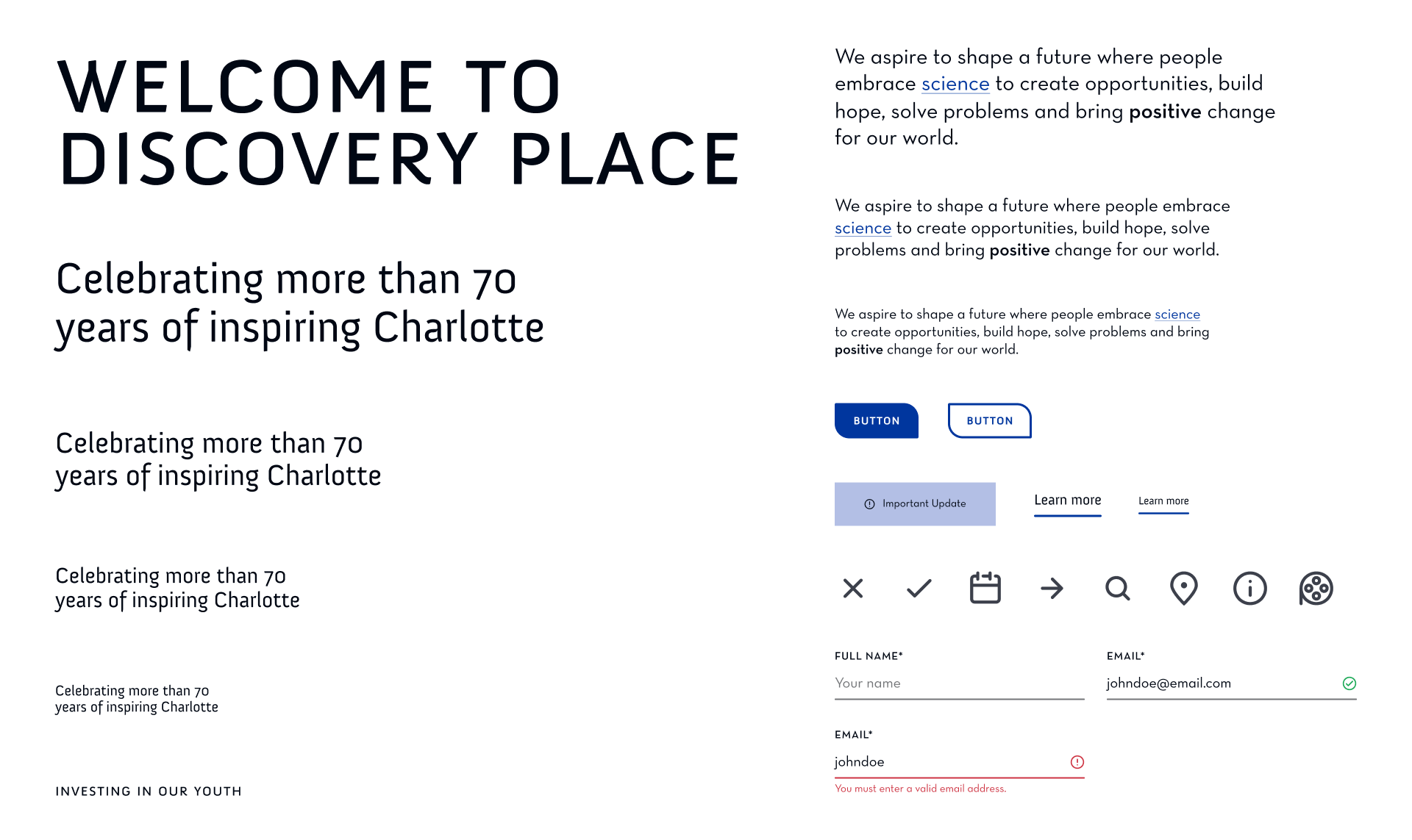
I utlized both brand fonts, Neutra and Anivers, as they are strong, modern fonts that harmonize well with each other. Neutra Text (Alt) is used throughout the website for all body copy and functional UI since it is clearly legible. Anivers is used in as an accent for headings and other supplemental items.
Design System
Discovery Place museums are currently seen as places for just children to go, a perception that the team at Discovery Place wanted to change. Along with better representation through imagery and content, I envisioned a design system that explored shapes as a means to represent the wide range of age groups that can enjoy all that Discovery Place museums have to offer.
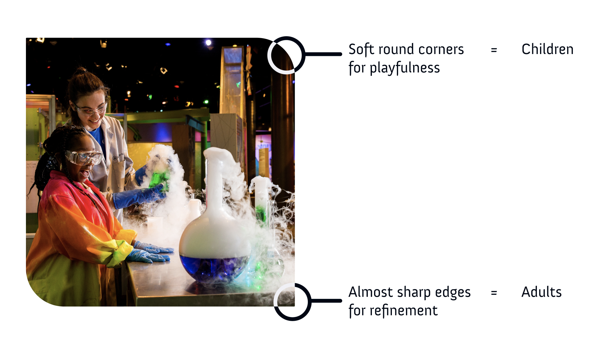
The idea was to make a shape that not only reflects the combination of the playfulness of childhood with the structure of adulthood. I was first inspired by the Discovery Place logo and seeing the mixture of the round circle with the triangular shape on the interior.
This treatment is used throughout both websites in design elements such as image containers, cards, card grids, buttons, footer styling, popup menu styling, and more.
Interactivity
Since the Discovery Place museums and IMAX theater are sensory experiences, I wanted to bring that to the websites as well by adding in more subtle motion elements tied into bold, clean layouts in order to draw people in.
For buttons, I wanted the interaction to feel unique and fun, having the corners reverse at the same time as the color switching to outline.
To increase interaction awareness, I ramped up the card and link animations. I did this by having the lines shrink underneath the label at the same time as the image expanding, which gave a nice tightening effect overall.
With the sheer amount of content that needed to be surfaced in the navigation, I created a three-tiered navigation with popup menus that appear upon clicking main level items. Motion and hover states were key here to allow users to understand what could and could not be engaged with.
Key Solves
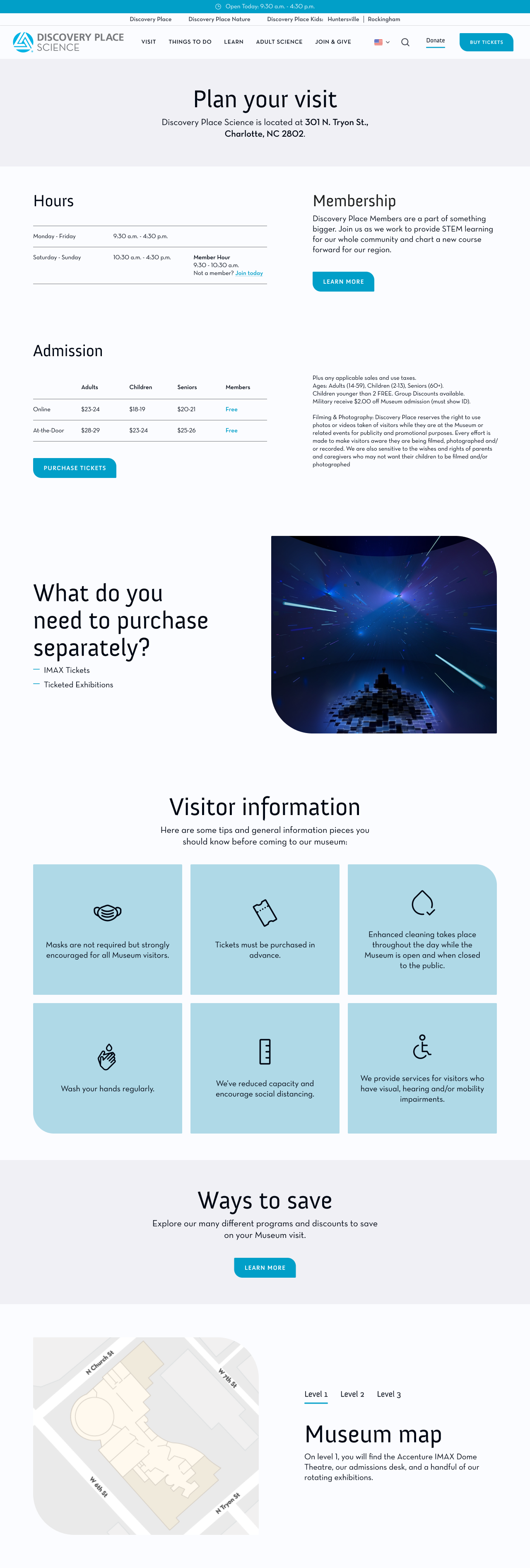
Information Digestibility
For all events, exhibitions, and IMAX listings, I brought the pertinent information above the fold for quick digestibility.
Better Filtering
The filter system needed a major revamping, so with this, age, subjects, and date range were nested into one mega filter that allows the user easier customizability, including the new functions of “this week” and “custom” range for dates.
Visual Cues
Event cards now have iconography along with key information that help users better understand what they have to offer. These carousels utilize a distinct visual hierarchy to ensure there are no questions of how to interact with it.
Museum Relationships
Now, Discovery Place museums and their relationships are broken down in a clear and visually appealing module that links out to the individual websites from the corporate website’s homepage.