
Established creative direction aligned to brand and business goals.
―
I set creative direction and visual storytelling frameworks for projects by defining the design vision, narrative arc, and quality bar from the outset, even when I am not the primary executor. Through workshops, concept exploration, and structured feedback, I guide teams toward cohesive solutions that align business goals, user needs, and brand expression. My role focuses on shaping how ideas are communicated visually and emotionally, ensuring consistency, clarity, and impact across the final experience while empowering designers to bring that vision to life.
Williams
This design direction embraces movement and evolution through overlapping layouts, flowing custom shapes, and interactive moments that reflect the brand’s forward-thinking spirit. Typography and color are used with intention—pairing Bebas Neue with Work Sans and relying primarily on Williams’ core blues, accented by subtle secondary tones to maintain focus and restraint. Hover states, glowing buttons, and light-based interactions evoke the energy of motion, while gradient icons and background patterns reinforce a story of connection, development, and continuity across the experience.
Digital Science
This design direction establishes a bold yet refined visual language that signals innovation through expressive typography, purposeful motion, and a focused color palette. By elevating type as the primary storytelling element and using imagery as a supporting accent, the system emphasizes clarity, intention, and confidence. Subtle animation, graphic treatments, and symbolic image masks rooted in the concept of “origin” and “cornerstone” connect the visual experience to the company’s role within its community, creating a cohesive narrative that feels both modern and deeply grounded in brand meaning.


Northeastern University
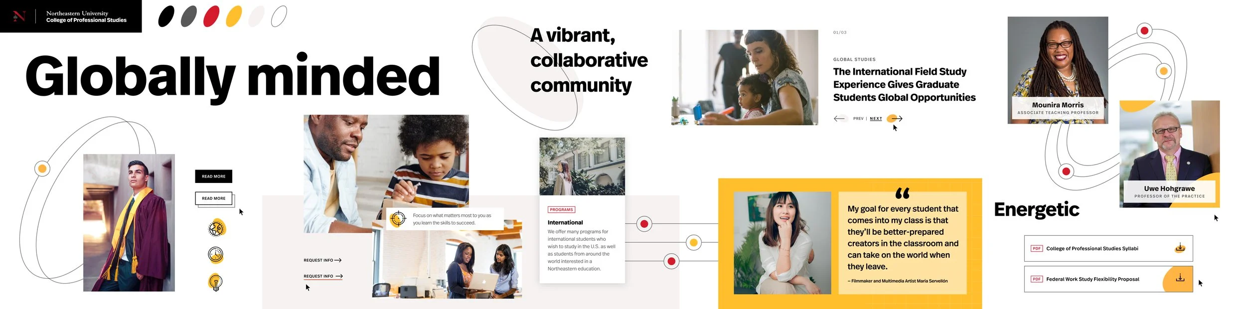
This design direction expresses a globally minded, energetic identity through vibrant color, dynamic patterns, and inclusive visual language. A blend of sharp imagery and rounded cards symbolizes both precision and the broad reach of the community, while shapes and icons amplify key actions and content with a sense of motion and connectivity. The consistent use of FF Real Head Pro establishes hierarchy and harmony, and an expanded secondary color palette—anchored by gold and red accents—allows CPS to stand apart while maintaining Northeastern’s core visual foundation. Imagery focused on people in action further reinforces a human-centered and forward-looking narrative.
Goettl
This design direction is built around the concept of flow, using motion, line, and layout to visually represent the essential services the brand provides—air, water, and heat. Flowing background elements, kinetic animations, and rounded iconography create a sense of movement and approachability, while the Bilo type family adds warmth and character to the system. A bright, energetic color palette led by red call-to-action moments and softened with blues, gradients, and orange accents reinforces clarity and momentum. Modular masonry layouts and rounded imagery support a flexible, service-driven experience that feels dynamic, accessible, and customer-focused.